Within Evidence Types
Before you trust the chart
A chart can make a pattern look settled, but the dataset, sampling and methods decide whether the pattern is real.
On this page
- What a chart alone cannot show
- Questions to ask about datasets
- How anecdotes become false patterns
Page outline Jump by section
Introduction
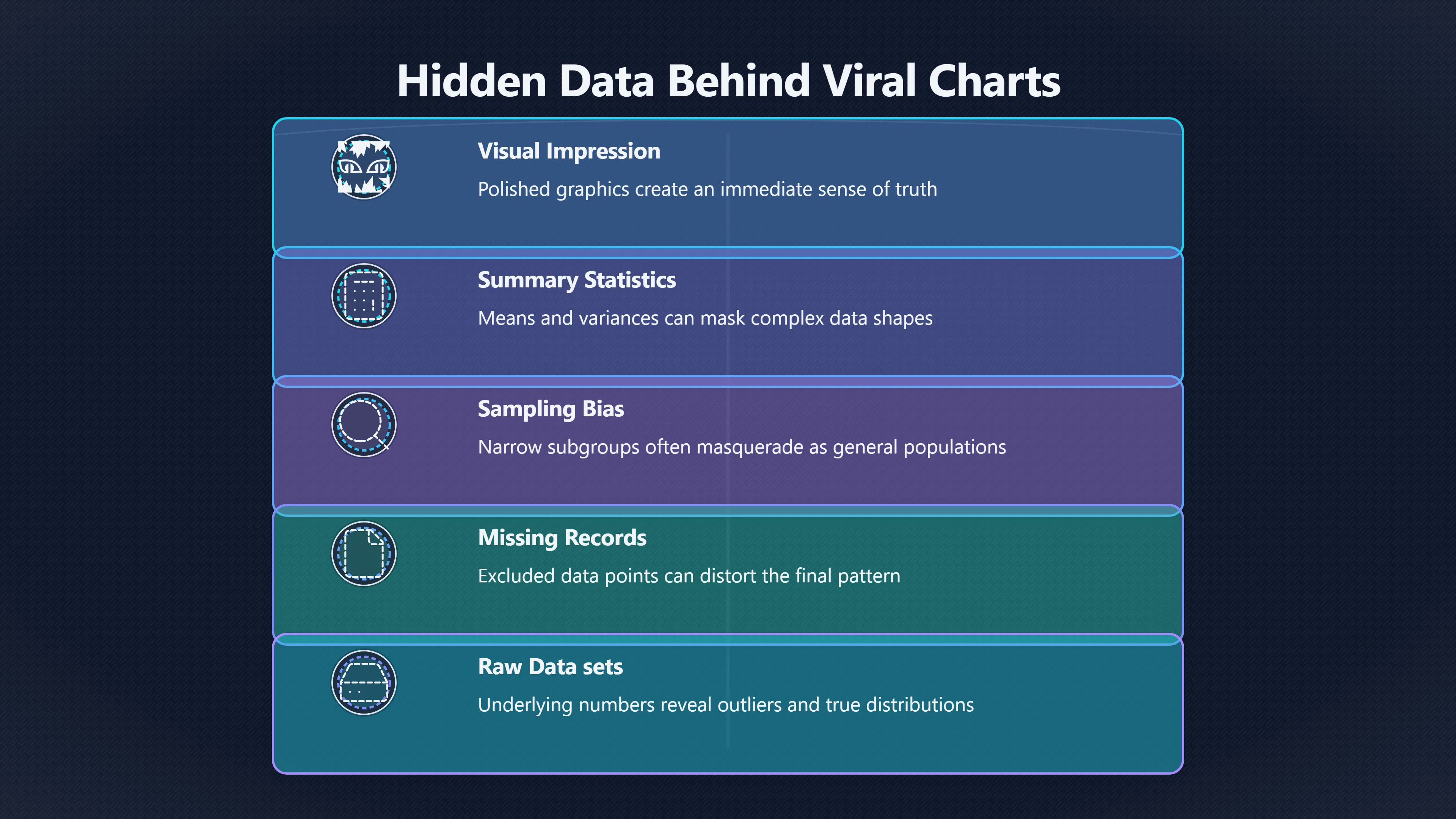
A viral chart can create the impression that a claim has already been proven. The visual pattern looks obvious, the trend line appears persuasive, and thousands of shares can make the conclusion seem settled. Yet a chart is only a representation of data. Without access to the underlying dataset, it is often impossible to know whether the apparent pattern reflects reality, a flawed sample, selective reporting, or a misleading presentation.
 In the broader evidence hierarchy for online claims, charts occupy an awkward position. They look more rigorous than anecdotes, but they are not self-verifying. The strength of a chart depends on the quality of the data beneath it, how that data was collected, what was excluded, and whether the visual accurately represents the evidence. When a chart goes viral without its dataset, readers are asked to trust the conclusion while remaining unable to inspect the foundation.
What a chart alone cannot show
A chart can display a relationship, but it cannot automatically explain where the numbers came from. Two graphs may look equally professional while being built from datasets of radically different quality.
Without the underlying data, important questions remain hidden:
- How many observations were included?
- Who or what was measured?
- Over what time period?
- Were any records removed?
- How much missing data existed?
- Were the measurements independently verified?
A striking upward trend might be based on millions of observations or only a handful. A dramatic comparison between groups might disappear if a larger or more representative sample were included. The chart itself often cannot answer these questions.
The problem becomes even more significant on social media, where charts are frequently cropped, reposted, translated, or detached from their original context. Axis labels, methodological notes, sample descriptions and caveats may disappear during sharing, leaving only the visual impression.
Research on misleading visualisations has shown that readers can be strongly influenced by chart design choices even when those choices distort the underlying evidence. Recent studies have also found that both humans and AI systems can be misled by deceptive chart presentations, highlighting how vulnerable visual interpretation can be when supporting data and methods are unavailable. [arXiv]arxiv.orgIs this chart lying to me? Automating the detection of misleading visualizationsAugust 29, 2025…
Questions to ask about datasets
The fastest way to evaluate a viral chart is often not to analyse the graphic itself but to investigate the dataset behind it.
Who collected the data?
Data collection is never neutral. Government agencies, academic researchers, companies, advocacy groups and private individuals may all gather data using different standards and incentives.
Knowing the source helps readers judge whether the dataset is likely to be comprehensive, representative and transparent. A chart based on a public dataset with documented methods is generally easier to evaluate than one built from unspecified proprietary data.
How was the sample chosen?
Sampling determines whether conclusions can be generalised beyond the observed cases. A chart may appear to describe an entire population while actually reflecting only a narrow subgroup.
For example, online polls often measure the behaviour of people who chose to participate rather than a representative sample of the broader public. Statistical inference depends heavily on sampling methods because conclusions about larger populations are only as reliable as the sample used to estimate them. [rotel.pressbooks.pub]rotel.pressbooks.pubinferential statistics sampling methodsInferential Statistics: Sampling MethodsOctober 31, 2023 — Statistical inferential methods make predictions or inferences about a larger…
What is missing?
Missing data can matter as much as included data.
A chart may not reveal whether records were unavailable, excluded, or filtered out. If particular groups are systematically absent from the dataset, the resulting pattern can be distorted. Readers should look for documentation describing missing values, exclusions and data-cleaning decisions rather than assuming the chart presents a complete picture. [Medium]medium.comThe Impact of Missing Data on Statistical Analysis and How…August 23, 2025 — Learn effective techniques for handling missing dat…

Can others inspect the numbers?
Transparency allows verification. When datasets are publicly available, independent analysts can test whether the chart’s conclusions follow from the evidence.
A chart that cannot be traced back to inspectable data requires a higher degree of trust in whoever created it. In critical discussions, that trust should be earned rather than assumed.
How anecdotes become false patterns
One reason viral charts spread so effectively is that they transform scattered stories into something that looks quantitative.
Imagine a topic already generating strong emotions online. Individual anecdotes accumulate: screenshots, personal experiences, news stories and isolated incidents. Someone then creates a chart claiming these examples demonstrate a large trend. The visual format gives the impression that the anecdotes have become evidence.
However, a chart does not automatically solve the problem of selection bias. If the underlying dataset was built by collecting only highly visible examples, the chart may simply visualise the bias that already existed.
This is a common pathway from anecdote to apparent pattern:
- Memorable incidents receive disproportionate attention.
- Those incidents are collected into an informal dataset.
- A chart is produced from that dataset.
- The chart is interpreted as proof of a broader trend.
At each stage, the apparent strength of the evidence increases even though the underlying sampling problem remains unresolved.
The chart may therefore communicate a pattern that exists within a curated collection of examples rather than within the real-world population it claims to represent.
When the same statistics tell different stories
A classic lesson from statistics demonstrates why access to data matters.
In 1973, statistician Francis Anscombe created four datasets that shared nearly identical summary statistics, including means, variances, correlations and regression lines. Yet when plotted, the datasets looked dramatically different. One showed a roughly linear relationship, another a curved pattern, another was heavily influenced by a single outlier, and another derived much of its apparent relationship from one influential data point. [Wikipedia+2Matplotlib]WikipediaAnscombe's quartetAnscombe's quartet
The lesson is often presented as an argument for visualisation, but it also illustrates the reverse principle: summaries alone can conceal important features of the underlying data.
A viral chart can create a similarly incomplete picture. The visible graph may look convincing, but the underlying observations could reveal outliers, clustering, missing values, subgroup differences or other features that substantially change the interpretation. Access to the dataset allows independent inspection of those possibilities.

Why AI makes dataset access even more important
AI tools can now generate charts rapidly from spreadsheets, prompts and automated analyses. This increases the volume of visual claims circulating online and lowers the cost of producing persuasive-looking graphics.
Recent research has highlighted concerns that misleading charts can be generated at scale and that both human viewers and advanced AI systems can be influenced by deceptive visual presentations. In some cases, the underlying data remains unchanged while design choices alter interpretation. [arXiv]arxiv.orgChartAttack: Testing the Vulnerability of LLMs to Malicious Prompting in Chart GenerationJanuary 19, 2026…
As chart creation becomes easier, the evidential value of the dataset becomes more important, not less. A polished graphic is no longer strong evidence that careful analysis occurred. Readers increasingly need access to the numbers, methods and assumptions behind the image.
Before you trust the chart
When a chart appears in a social feed, the key question is not whether the graphic looks professional. The key question is whether the evidence behind it can be examined.
A trustworthy chart should allow readers to trace the claim back to its dataset, understand how the data was collected, evaluate the sampling process, inspect exclusions and verify that the visual accurately reflects the underlying numbers. Without those elements, the chart remains an assertion expressed through graphics rather than a fully inspectable piece of evidence.
In an online environment where images travel faster than documentation, the dataset is often the difference between a persuasive picture and a reliable claim.
Amazon book picks
Further Reading
Books and field guides related to Before you trust the chart. Use these as the next step if you want deeper reading beyond the article.

Data Detective
First published 2021. Subjects: Statistics, Methodology, Social sciences, Statistical methods, Business.
eBay marketplace picks
Marketplace Samples
Example marketplace items related to this page. Use the search link to explore similar finds on eBay.


Endnotes
-
Source: arxiv.org
Link: https://arxiv.org/abs/2508.21675Source snippet
Is this chart lying to me? Automating the detection of misleading visualizationsAugust 29, 2025...
Published: August 29, 2025
-
Source: arxiv.org
Link: https://arxiv.org/abs/2503.18172 -
Source: rotel.pressbooks.pub
Title: inferential statistics sampling methods
Link: https://rotel.pressbooks.pub/statisticsthroughequitylens1/chapter/inferential-statistics-sampling-methods/Source snippet
Inferential Statistics: Sampling MethodsOctober 31, 2023 — Statistical inferential methods make predictions or inferences about a larger...
Published: October 31, 2023
-
Source: medium.com
Link: https://medium.com/%40tarangds/the-impact-of-missing-data-on-statistical-analysis-and-how-to-fix-it-3498ad084bfeSource snippet
The Impact of Missing Data on Statistical Analysis and How...August 23, 2025 — Learn effective techniques for handling missing dat...
Published: August 23, 2025
-
Source: Wikipedia
Title: Anscombe’s quartet
Link: https://en.wikipedia.org/wiki/Anscombe%27s_quartet -
Source: matplotlib.org
Link: https://matplotlib.org/stable/gallery/specialty_plots/anscombe.htmlSource snippet
Anscombe's quartet — Matplotlib 3.10.9 documentationAnscombe's quartet is a group of datasets (x, y) that have the same mean, standard de...
-
Source: arxiv.org
Link: https://arxiv.org/abs/2601.12983Source snippet
ChartAttack: Testing the Vulnerability of LLMs to Malicious Prompting in Chart GenerationJanuary 19, 2026...
Published: January 19, 2026
-
Source: arxiv.org
Link: https://arxiv.org/abs/2508.09716 -
Source: arxiv.org
Title: Is this chart lying to me?
Link: https://arxiv.org/html/2508.21675v1Source snippet
Automating the detection of...29 Aug 2025 — Misleading visualizations are charts that distort the underlying data, typically by violatin...
-
Source: arxiv.org
Link: https://arxiv.org/abs/1808.09913Source snippet
Same Stats, Different Graphs (Graph Statistics and Why We...by H Chen · 2018 · Cited by 13 — To study the relationships between differen...
-
Source: arxiv.org
Link: https://arxiv.org/pdf/2408.11160Source snippet
Statistical Problems with Image Datasetsby J Goldman · 2024 · Cited by 5 — We discuss empirical work demonstrating the bias in current co...
-
Source: medium.com
Link: https://medium.com/analytics-vidhya/beating-anscombes-quartet-using-data-visualization-and-summary-statistics-to-understand-your-data-b2c709c244e9Source snippet
summary statistics to understand your data · Anscombe's Quartet, plotting in Python using...Read more...
-
Source: medium.com
Link: https://medium.com/analytics-vidhya/anscombes-quartet-an-importance-of-data-visualization-856b3d1bd403Source snippet
Anscombe's Quartet — An Importance of Data VisualizationVisualizing our data allows us to revisit our summary statistics and re-contextua...
-
Source: medium.com
Link: https://medium.com/%40Ana_kin/graphs-gone-wrong-misleading-data-visualizations-d4805d1c4700Source snippet
Let me show the most popular misleading graphs and how anyone can easily identify those!Read more...
Additional References
-
Source: researchgate.net
Link: https://www.researchgate.net/publication/230621909_Statistical_process_control_for_data_without_inherent_orderSource snippet
Statistical process control for data without inherent orderThe XmR chart is a powerful analytical tool in statistical process control (SP...
-
Source: pearson.com
Link: https://www.pearson.com/channels/business-statistics/study-guides/chapter-1-using-graphs-to-describe-dataSource snippet
Statistics for Business Study Guide: Graphs & Data AnalysisThis study guide covers key statistics concepts for business, including data t...
-
Source: youtube.com
Link: https://www.youtube.com/watch?v=kThRTrsBr9oSource snippet
Data Ready Part 7: Misleading Data VisualizationsThis video will go over common misleading tactics used in data visualizations and how to...
-
Source: linkedin.com
Link: https://www.linkedin.com/pulse/why-visualizing-data-matters-anscombes-quartet-real-world-akila-86otcSource snippet
summary statistics alone may not be sufficient to capture the essence of a dataset, and visual...Read more...
-
Source: r-bloggers.com
Title: the importance of graphing your data anscombes clever quartet
Link: https://www.r-bloggers.com/2019/03/the-importance-of-graphing-your-data-anscombes-clever-quartet/Source snippet
The importance of Graphing Your Data – Anscombe's...Mar 19, 2019 — He demonstrates this by generating four different data sets (Anscombe...
-
Source: dev.to
Title: importance of data visualization anscombe s quartet way 5693
Link: https://dev.to/imsparsh/importance-of-data-visualization-anscombe-s-quartet-way-5693Source snippet
Importance of Data Visualization — Anscombe's Quartet WayJul 27, 2020 — It was constructed in 1973 by statistician Francis Anscombe to il...
-
Source: useproactiveai.com
Title: good and bad examples of data visualization in 2026
Link: https://www.useproactiveai.com/blog/good-and-bad-examples-of-data-visualization-in-2026/Source snippet
27 Mar 2026 — Explore good and bad data visualization examples, misleading graph examples, and design principles that help businesses pre...
-
Source: nveil.com
Title: anscombe quartet statistics visualization
Link: https://www.nveil.com/anscombe-quartet-statistics-visualization/Source snippet
Anscombe's Quartet: Four Datasets, One Blind Spot.Mar 31, 2026 — In 1973, statistician Francis Anscombe constructed four small datasets t...
-
Source: facebook.com
Link: https://www.facebook.com/groups/158265424752351/posts/931182650793954/Source snippet
to find the probability that it falls within the...Read more...
-
Source: analythical.com
Title: examples of awful data visualization
Link: https://analythical.com/blog/examples-of-awful-data-visualizationSource snippet
5 Examples of Awful Data Visualization19 Jan 2026 — Explore examples of poorly designed dataviz and learn how to fix them, discovering va...
Topic Tree